
Why Your Program Health Metrics Are Lying to You
Why Your Program Health Metrics Are Lying to You
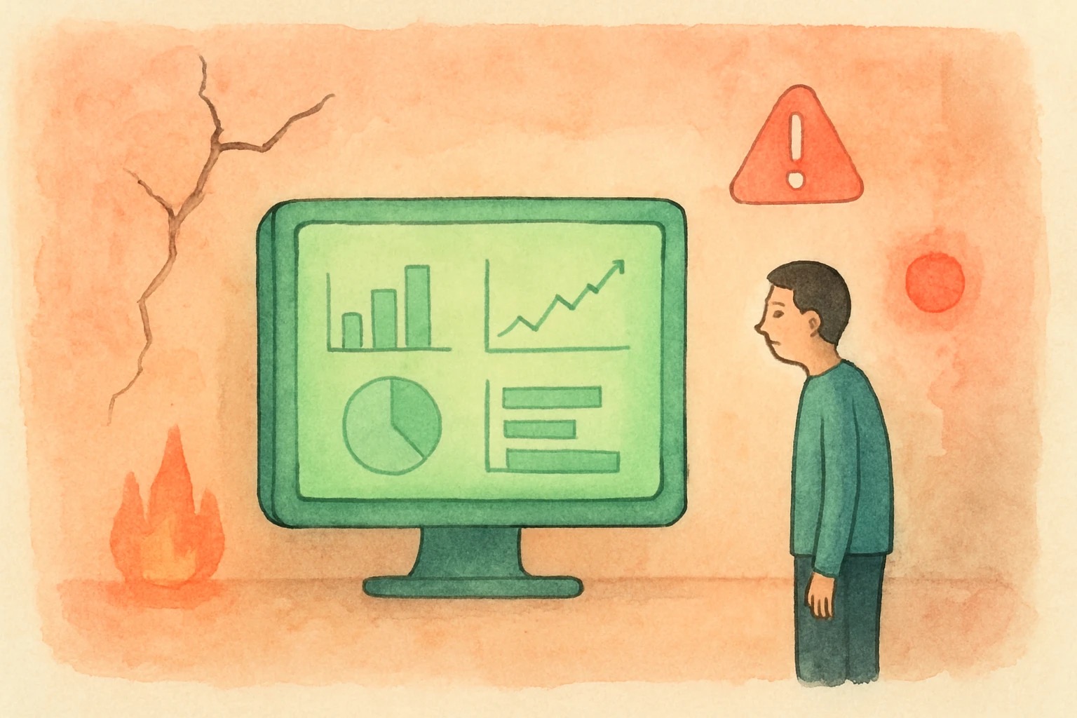
Green dashboards. On-track status reports. A burn-down chart that looks exactly like it's supposed to look. And then, six weeks later, the program blows up.
I've watched this happen enough times to stop trusting the dashboard before I trust the conversation. Not because the numbers are fake — the numbers are usually accurate. But the framing, the selection, the timing of when things get called out versus when they get smoothed over — that's where the corruption starts, and it starts earlier than anyone wants to admit.
The Dashboard Is a Negotiation, Not a Measurement
Here's what nobody puts in the status report: the RAG status was negotiated in a meeting, not read from the data. Green gets assigned because the TPM and the EM have a relationship, because the week before was rough and everyone needed a win, because calling something red means paperwork, escalation, and a conversation nobody has bandwidth for.
I've been in those rooms. I've seen the look that says "just give us green this week and we'll fix it for real next week." And I've seen "fix it for real" never come, because the green kept the oxygen flowing — kept the program off the executive radar, kept the resourcing conversation quiet, kept the steering committee from asking hard questions.
The metric isn't neutral. The act of choosing what to measure, how to present it, and when to call it out — that's a social process. Numbers don't lie, but the people selecting and presenting them have strong opinions about what the numbers should say.
How the Corruption Actually Works
It starts small. A dependency that slips two days doesn't get flagged because "we'll recover." A resource conflict doesn't get escalated because naming it means admitting the plan was wrong. A technical risk gets recategorized as a "known issue" so it stops appearing in the weekly review.
None of these feel like lying in the moment. Everyone tells themselves they're being pragmatic, protecting the program, avoiding noise. But the cumulative effect is a status report that describes a program that doesn't exist — a polished version of reality that gets maintained until it can't be anymore.
The burn-down chart is the clearest tell. I've seen sprint burn-downs that look perfect — consistent velocity, clean line — and the program was quietly hemorrhaging. The chart was accurate to the work that was being tracked. The work that was being tracked had quietly stopped including the hard stuff.
The three mechanisms:
Member discussion