TPM University Monthly Newsletter March 2025 Edition


Defrosting a bit as we enter March, the industry is still quite dynamic unfortunately. I am sending out positive vibes to my fellow TPMs around the world, giving you the strength to be resilient. For those of you still searching for new opportunities, continue to learn and open your minds to new things. In that spirit, I have some links to post as well as my month’s article on PowerBI.
To get access to my articles and newsletter a few days earlier, straight to your inbox, why not subscribe by going to doronkatz.com. Feel free to also follow me on X on @doronkatz or @tpmuniversity.
📰 News & Articles of Interest
- OpenTelemetry Metrics Explained: A Guide for Engineers
- PMBOK: The Project Management Body of Knowledge Explained
- Mastering Data Consistency Across Microservices
- Stakeholder Engagement in Project Management
- Explore GitHub Codespaces 🚀: Your Development Environment in the Cloud 🤩☁️👌
- Introduction to Kubernetes 🐳: Key Concepts
- Mind mapping in project management using Wrike and Klaxoon
Getting Started with PowerBI for TPMs

My current role has called out for me to dive deep into Microsoft’s PowerBI tools. As a TPM, data is the lifeblood of decision-making, but somehow I have made it so far without really getting into creating dashboards with PowerBI. I have used other similar tools, but in my current career trajectory in the SRE space, enter Microsoft’s answer to interactive data visualizations to help us make sense of how my organization’s systems are operating.
But before you tune-out, this isn’t specifically just for SRE-focused areas, but operational excellence, something that is of up-most importance to all engineering teams. Incident metrics, availability SLAs, latency trends, rather than dumpster-diving into the infinity of logs and Grafana dashboards, you want to make best use of your time as a TPM.
As the conduit between engineers, leadership and other stakeholders, you need to be able to have real-time insights at-hand to answer questions such as are we meeting our availability and latency targets?, or how often are deployments causing outages?, or Are engineers drawing in on-call pages?
Power BI is here to help you track, trend, and troubleshoot without pulling raw data every time someone asks, “How’s reliability looking?”
1. Setting up PowerBi
Granted, as a Mac-user, I wasn’t very happy to find out that Power BI desktop is only on Windows. Deciding to suck it up, I cranked out my virtual Windows instance. So go ahead and download Power BI Desktop and sign up for the trial, to give you access to everything you need.
2. Connecting to Data Sources
The next step is configuring a data source, the backend so to speak for your dashboards. When I got started I just used an excel spreadsheet stored on One Drive. You can update the data on that sheet and it will reflect in your dashboard. While crude, it helps you get going with your dashboard creation by mocking your backend while focusing on how you want your data to be visualized. Later on you can go back and connect a more robust backend, which could include:
- Prometheus/Grafana to provide insights into query logs and monitoring data;
- Splunk to capture operational metrics.
- JIRA to track incident tickets/change requests.
- AWS CloudWatch/Azure Monitor to get cloud service health insights.
To get started:
- Click “Get Data” in Power BI.
- Select your source (e.g., “SQL Server,” “API,” “Excel,” etc.).
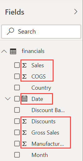
- Load the data into Power BI. If needed, use Power Query Editor to filter, clean, and format messy data. For me I had some null values in columns that messed up my data.

3. Building the Dashboard
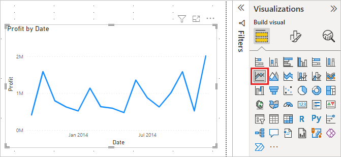
Once you are set on what you want to visualize, such as incident metrics, on-call workload, or any of the four golden signals, it is time to start building the dashboard. This part was really straightforward for me. On the right-hand side you will see your data-source decomposed into columns along with the tool’s assertion of what type of data that column is, such as date.
You can select which column or columns you want from that list, and then select a widget to use, such as line-graph.
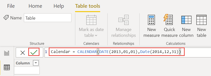
You can play around with the style using the format property pane on the right as well. Of course, if the data doesn’t quite look right, you can create calculated columns or measures. Microsoft uses a language framework called DAX which is beyond the scope of my post here, but it isn’t as complicated as it sounds. In fact, I use ChatGPT to help me craft complicated DAX statements to help me combine columns with smart aggregations.
Conclusion
There’s a lot more that goes into learning PowerBI. I started with the steps above and most importantly dedicated time every week to building my own dashboards, tweaking them, and starting over again as I learn more.
As great resources, I recommend Microsoft’s Tutorials or if you are more of a visual learner, I searched LinkedIn Learning for PowerBi courses. I can’t emphasize enough the importance of being able to create your own dashboards and connect your own data sources as opposed to depending on other teams.
🎙️Catch up on your TPM Ridge Podcast episodes
#12 Aligned with Bruce McCarthy & Melissa Appel Apple / iHeart / Spotify
If you enjoy the show, consider subscribing to it on your favorite podcast.
… and something from the funny paper

Thanks to Comic Agile